How do you design a brand identity for a listening bar that lives between daylight comfort and midnight magic?
An identity rooted in the golden hour, where retro warmth meets supernatural intrigue.
The Brief
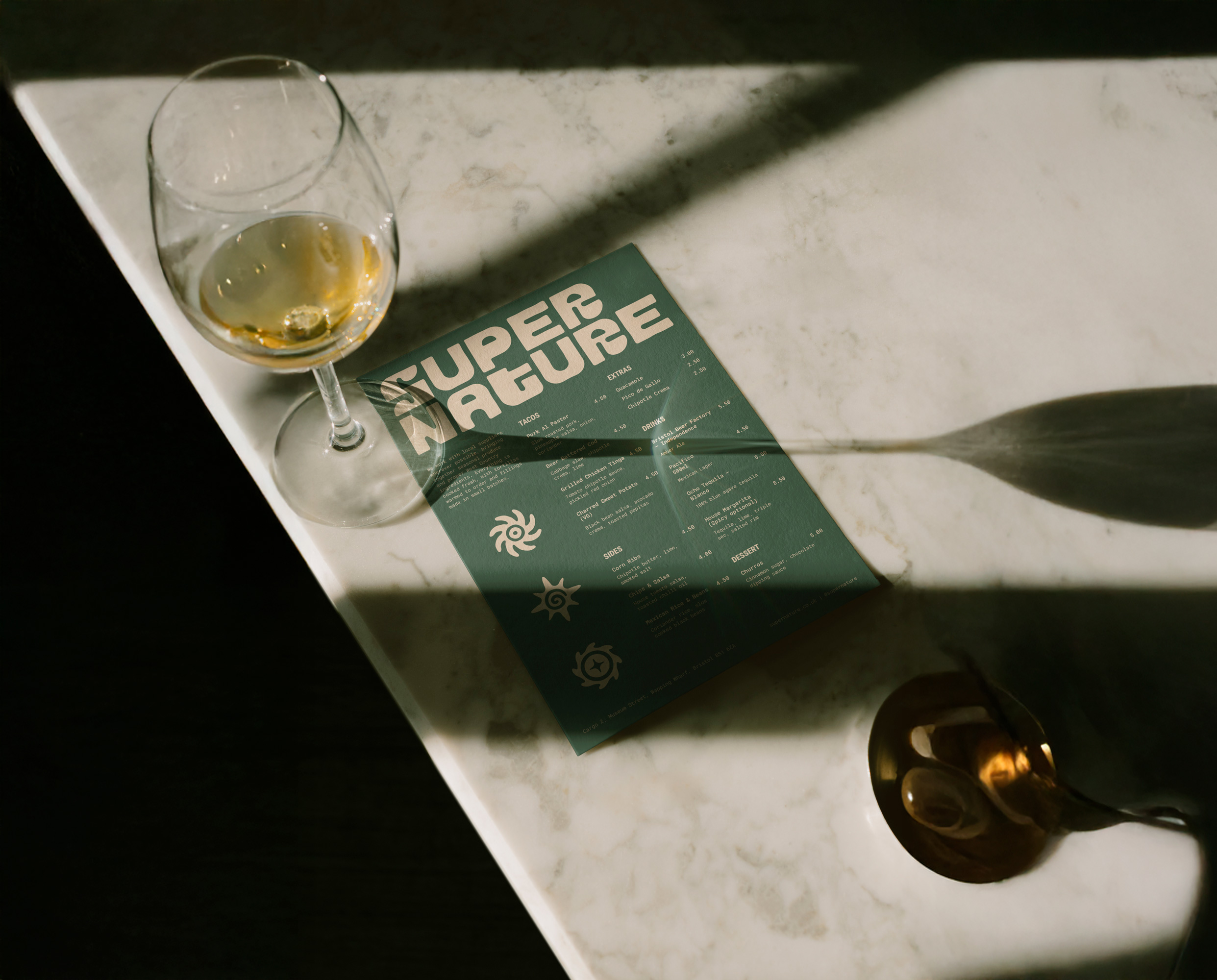
Supernature needed a distinctive brand identity for a new Bristol listening bar combining global music culture with locally sourced food. The hospitality brand needed to feel welcoming, retro-inspired and characterful, capturing the balance between natural and supernatural, day and night, through bold typography, earthy colours and expressive iconography.
The Solution
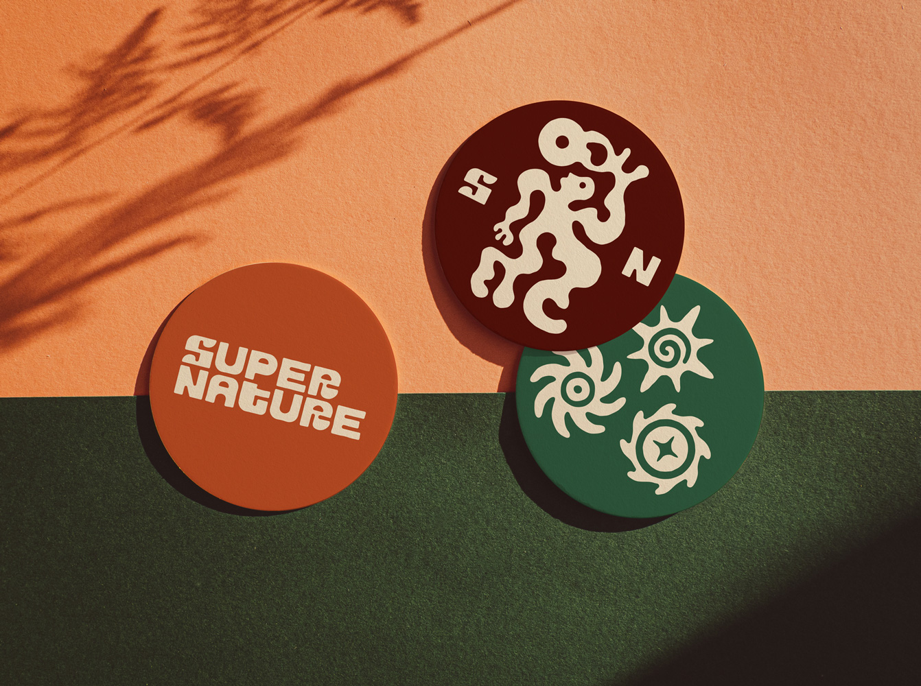
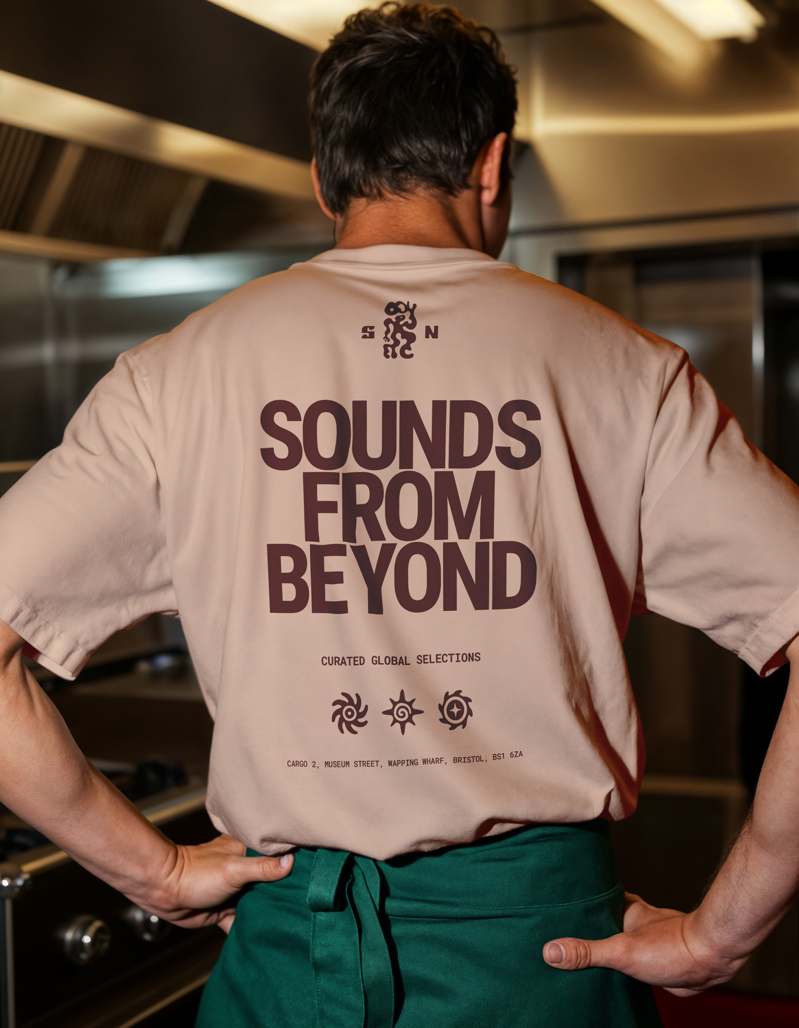
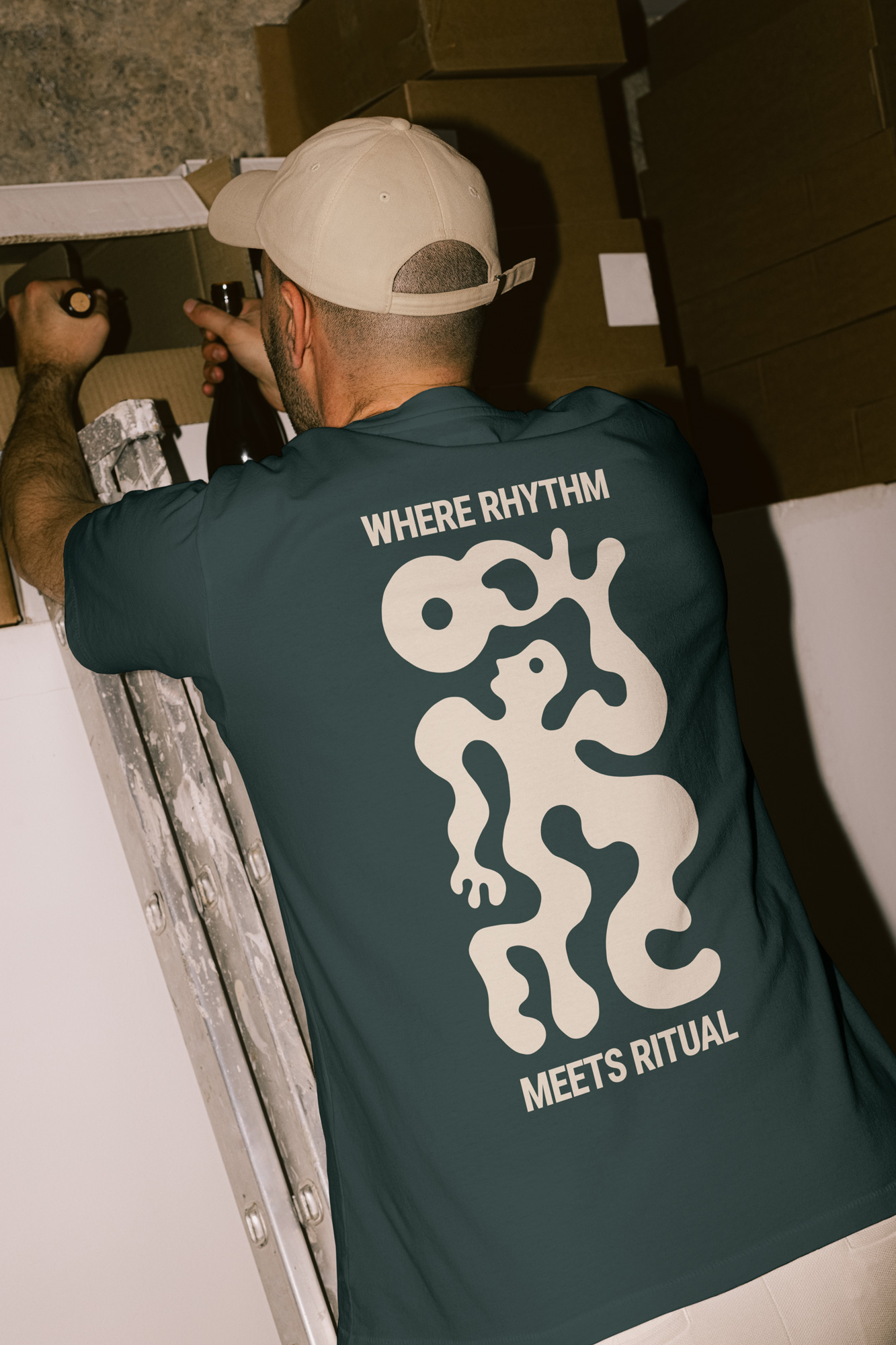
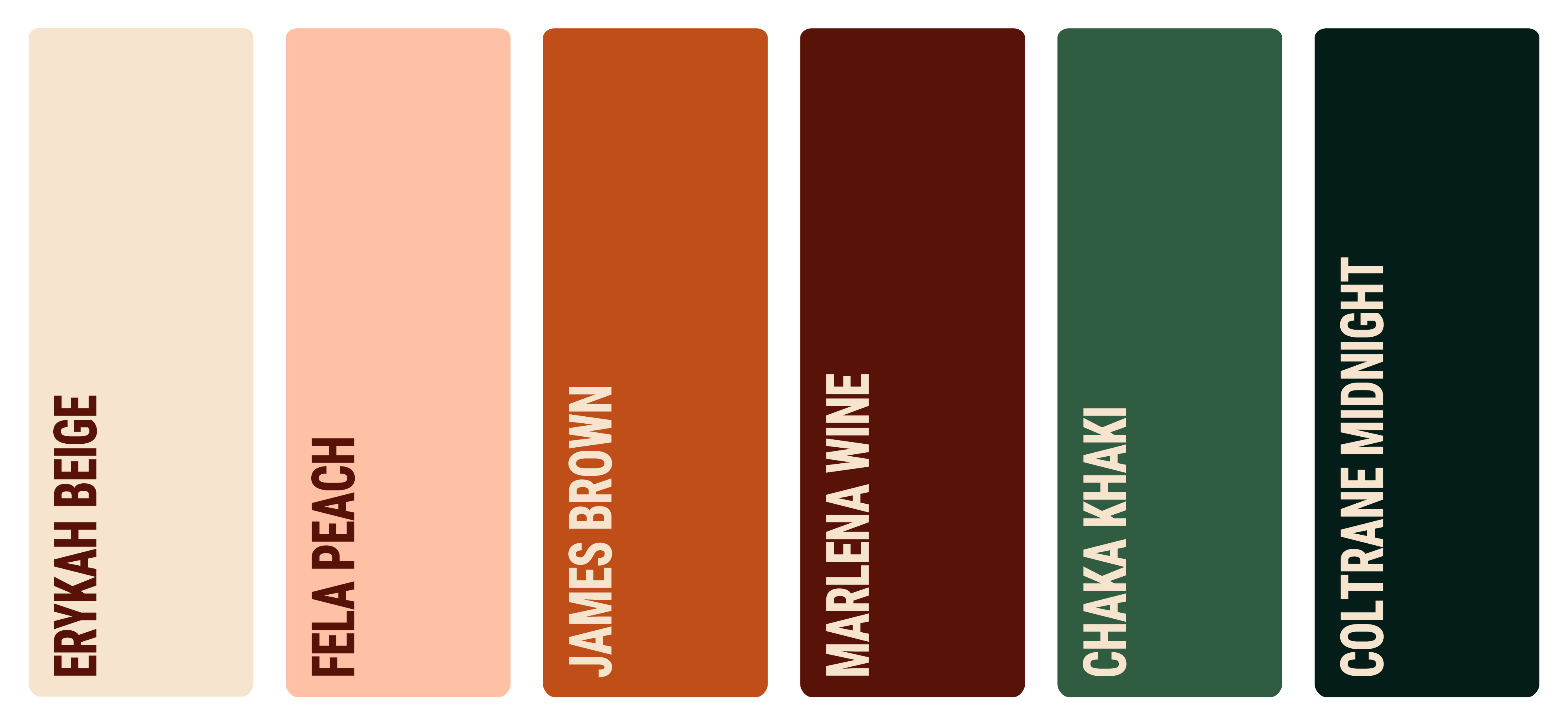
The solution was a retro-inflected brand identity capturing Supernature’s shift from local food by day to global music by night. A warm “golden hour” colour palette echoed the venue’s 60s-inspired interior, intimate lighting and dark wood textures. A bold display typeface paired with a bespoke hand-drawn logo created a distinctive visual identity. A suite of hand-drawn icons, featuring vibrating figures, spirals, plants and organic shapes- referenced sound, rhythm and movement across the brand system.
Supernature is a Bristol listening bar built around music culture, natural produce and curated hospitality experiences. The project included logo design, typography, colour palette development, icon design and a flexible brand system for use across menus, signage, merchandise and social media.